
Designing with Off-White: The Quiet Power of Pantone's colour of the year 2026
I’m often known for embracing confident colour — layered greens, warming terracottas, and rich tonal palettes that bring personality and presence into a space. Colour carries emotion. It energises, comforts, and tells a story.
Yet there is an undeniable sophistication in restraint.
With Pantone announcing PANTONE 11-4201 Cloud Dancer as the Colour of the Year for 2026, the design world is turning its focus to a hue that is anything but plain. Off-white, when selected and layered with intention, becomes a powerful design tool — offering serenity, versatility, and a quietly luxurious foundation.
This is not about “playing it safe.” It’s about understanding nuance.
Why Off-White Is So Enduring
True white can sometimes feel stark or clinical. Off-white, by contrast, carries softness. Subtle undertones — hints of brown, pink, or red — introduce warmth and complexity, allowing the shade to feel inviting rather than austere.
In high-end interiors, off-white performs three essential roles:
It amplifies light without glare.
It creates cohesion across architectural features.
It elevates surrounding materials, allowing texture and craftsmanship to take centre stage.
Used correctly, it becomes the canvas that makes everything else sing.
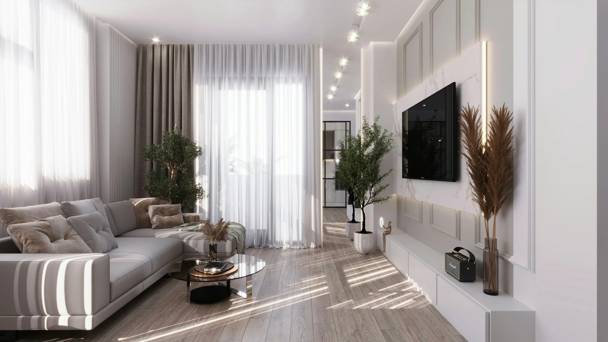
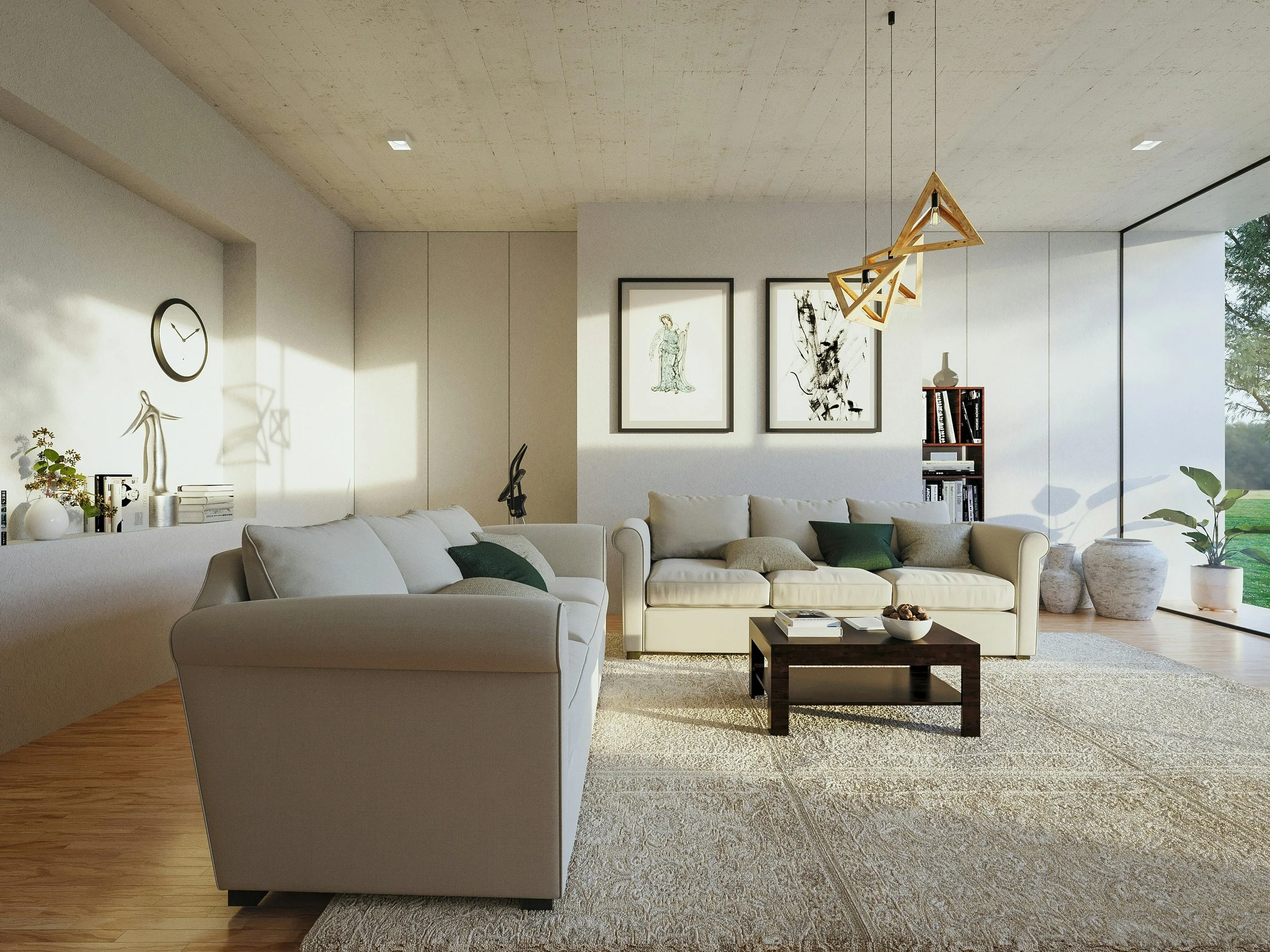
The Living Room: Understated, Elevated
In living rooms, off-white creates an effortlessly refined atmosphere. It is particularly effective in homes where architecture deserves breathing space — panelled walls, ceiling detailing, stone fireplaces, or sculptural lighting.
Because it is inherently neutral, it pairs beautifully with almost any palette. The key lies in layering:
Plaster walls in a warm off-white
Bouclé or linen upholstery
Softly veined marble
Washed oak or natural walnut
The result is not flat — it is dimensional. Depth comes from textural materials rather than colour contrast.
Layering for Warmth and Depth
Cream & Earthy Tones
Pairing cream with terracotta, clay, or muted rust introduces grounded warmth. This combination feels comforting and organic — ideal for family spaces or homes rooted in natural surroundings.
Taupe & Subtle Neutrals
For those who prefer an almost tonal palette, taupe layered with cream adds quiet depth. The effect is cocooning and elegant, particularly when finished with tactile fabrics such as wool, suede, or brushed cotton.
Greens & Organic Energy
One of my favourite pairings is warm off-white with green. From soft sage to deep forest tones, green introduces vitality without overwhelming the calm foundation.
Sage green + warm off-white + washed oak creates an airy yet grounded scheme.
Deeper greens add drama while maintaining refinement.
Indoor planting enhances contrast and brings life to the palette.
In each case, the off-white allows the green to breathe.
Undertones Matter — Especially in North-Facing Rooms
Light direction changes everything.
North-facing rooms tend to receive cooler, bluer light. If you introduce a cool white into that setting, the result can feel flat or even chilly.
Instead, choose an off-white with warm undertones — brown, pink, or subtle red. These counteract the cool daylight and ensure the space feels inviting year-round.
This is where sampling becomes essential. Always test your paint first and test it on all walls. A shade that looks creamy in one room may appear grey in another. Understanding undertones is the difference between serene and sterile.
Off-White Beyond Walls
While paint is the obvious starting point, off-white is equally powerful when applied to:
Upholstered sofas or armchairs
Cabinetry and bespoke joinery
Textured rugs
Statement headboards
Sculptural occasional pieces
In luxury interiors, repetition of tone — across different materials — creates cohesion and a sense of considered calm.
The Quiet Luxury of Restraint
Off-white is not an absence of colour; it is a study in subtlety. It allows craftsmanship, proportion, and texture to lead the narrative. In an era where overstimulation is constant, there is something profoundly elegant about spaces that feel light, grounded, and intentional.
As we look toward 2026 and the influence of Cloud Dancer, I see a continued appreciation for refined palettes that balance warmth and clarity. Whether used as a backdrop or as the central theme, off-white offers timeless sophistication — and, when layered thoughtfully, extraordinary depth.
If you’re considering incorporating an off-white into your home, the secret lies not just in the shade itself, but in what you pair it with.
Need a hand picking a new colour palette for your home? Book a free discovery call and let’s chat about how I can help.